Social Inclusion Monitor
Data visualization about the current state of social justice and regarding reforms in the EU for the Bertelsmann Stiftung
Website-
Cooperation with
-
Client
Bertelsmann Stiftung
-
Role
Design and prototyping
Intro
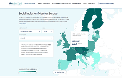
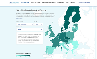
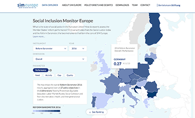
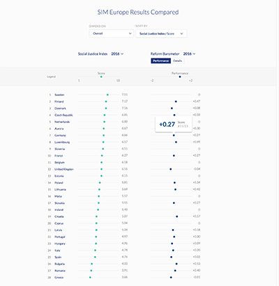
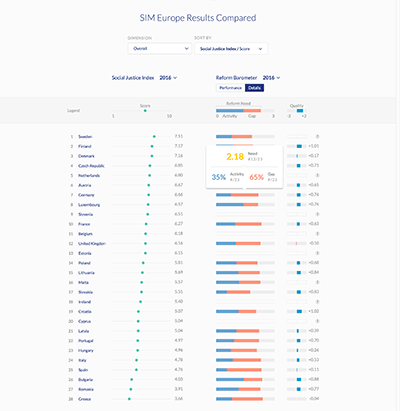
The Bertelsmann Stiftung provides with the Social Inclusion Monitor Europe a social policy monitoring instrument for the EU-28. They aim to provide data to facilitate the improvement of national and European policymaking on social inclusion through information, analysis, and evaluation of policies. My colleagues and I worked on the second version of the Social Inclusion Monitor to integrate the Reform Barometer as an additional metric to the visualization. The website consists of an overview of all EU countries and a detailed view of each particular country.
Design Process
-
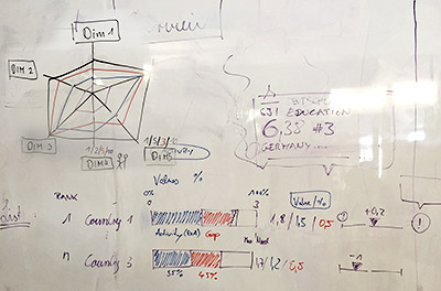
Workshop
We started our project with a workshop. We learned from the last version, that projects with this amount of domain knowledge, need a lot of communication, especially in the beginning.
-
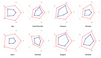
Data Exploration
After the workshop and a domain research, we explored the data and possible graphical representations.
-
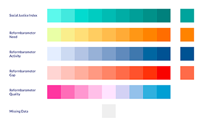
Data Elements
We used a good amount of time to create the graphical elements and color tones. It was quite challenging to find for each KPI a color space, that is distinguishable and aesthetical.
-
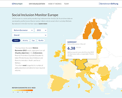
Screen Design
The final step was the screen design. I worked quite closely with Flavio who was developing the website to achieve the right balance of user experience and performance.
Final Design
-
Overview — Map
-
Overview — List
Learnings
It was great to work with Jan Arpe from the Bertelsmann Stiftung on this project. In the beginning, we learned it is crucial to look at the data first. We started designing the whole website without having the data. It can work if you are lucky, we weren't. We had to redesign parts of the page because the data wasn't that granular as we expected. We also gained a lot from this early mistake, once we've got the data, we did a lot of prototyping to test our assumptions before we got into screen design and found better solutions through this process.
